Portfolio TVPI Spectrum® Generator
A precise visual of where a portfolio's returns come from — at the investment, the portfolio-aggregate, or the fund level. Built by AQAL Capital, an integral-investing firm, for general partners, limited partners, and the advisors who report to them.
Enter (or paste) your DPI, RVPI, and amounts invested. Get a client-ready dual variwide diagram in seconds. Free. Runs entirely in your browser.
Fund Life Cycle
TVPI Spectrum®, a dual variwide diagram of portfolio performance
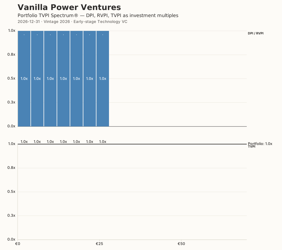

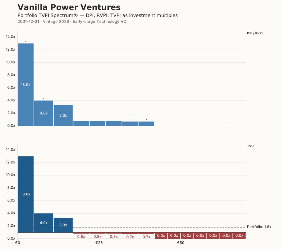
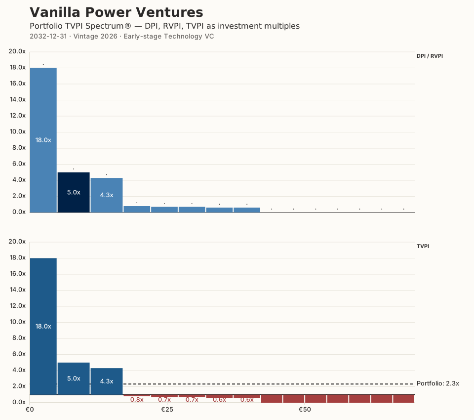
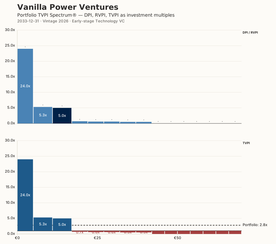
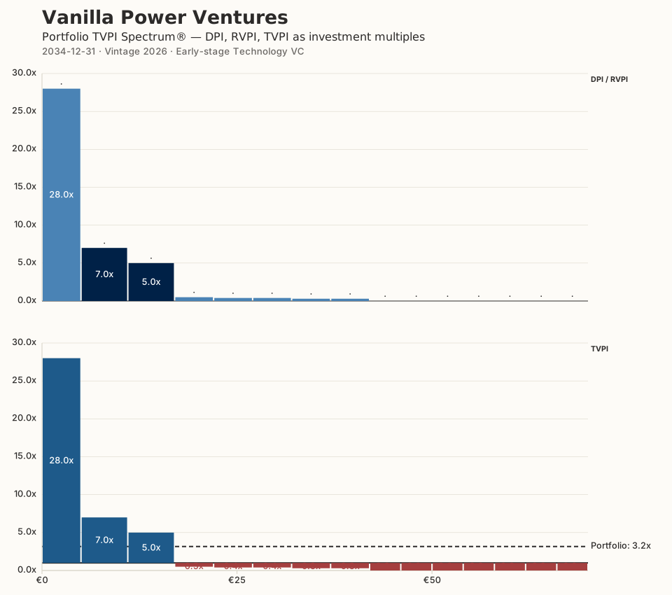
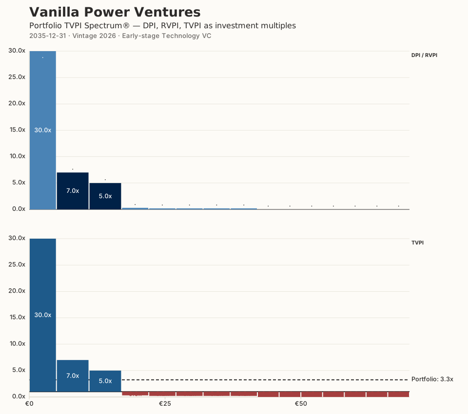
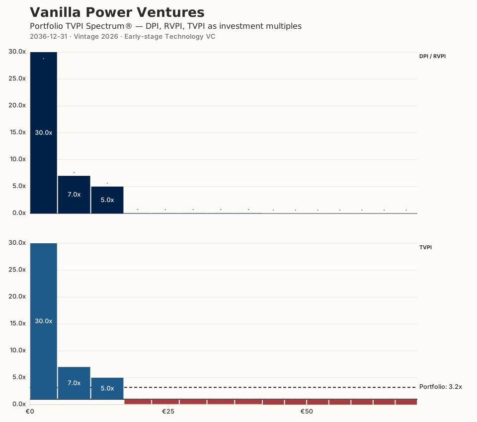
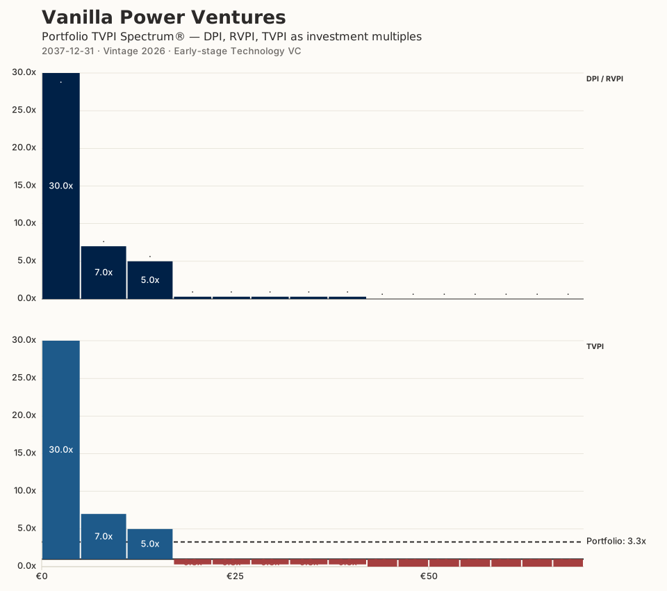
Capital deploys. Writing initial tickets. Every bar starts at 1.0×.
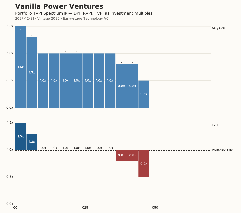
More initial tickets. A few early partial write-offs and losses as early bets fail to mark up. A few early up-rounds.
Still writing initial tickets. More partial write-offs. A few winners climb sharply. The rest stay flat. Busy transaction activity.
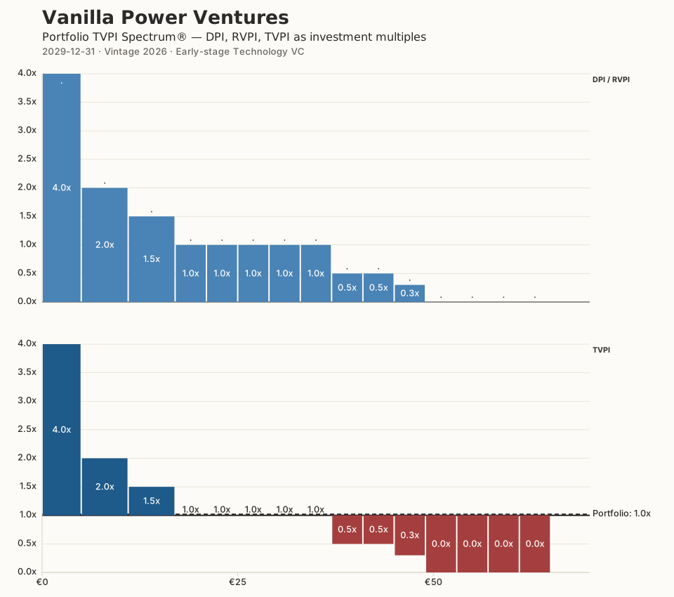
Still writing initial tickets. More partial and full write-offs. Follow-on investments in successful up-rounds. High transaction activity.
Last initial tickets. Bifurcation in full. Tall outliers, a middle pack at 1×–3×, a growing tail at zero.
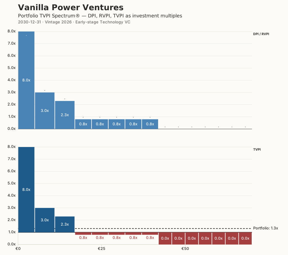
No more initial tickets. More partial and full write-offs. Follow-on investments in successful up-rounds. Leaders increase distance to field.
More partial and full write-offs. Follow-on investments in successful up-rounds. Leaders increase distance to field. First cash distributions from successful exits. Transaction activity diminishing.
More partial and full write-offs. Follow-on investments in successful up-rounds. Leaders increase distance to field. Focus on optimizing exits. Cash distributions from successful exits.
More partial and full write-offs. No more follow-on investments. Residual value crystallizes into cash distributions. The dark portion grows.
More partial and full write-offs. Leaders run away. Cash distributions from successful exits. Still significant valuable residual value left.
Leaders run away and exit. Cash distributions from successful exits.
Fund liquidated. All holdings distributed as cash or in kind.
Read the essay: The power law in venture capital portfolios — what the TVPI Spectrum® reveals over time →