Every limited partner has seen the headline number — the fund's TVPI at the most recent reporting date. Every analyst has seen the median multiple of a vintage cohort. Neither tells you what a venture portfolio is actually shaped like. The mean is pulled by the few investments that returned the fund several times over; the median sits flat in the broad middle where nothing dramatic happens. The information that matters most for portfolio construction — the distribution, the bifurcation, the way one or two outliers carry the rest — is hidden between the two summary statistics.
Sebastian Mallaby's The Power Law gave the venture industry a vocabulary for this. What it could not give — what no single number ever can — is a picture. The TVPI Spectrum®, a dual variwide diagram of portfolio performance, is that picture. Set against time, it shows something more useful still: the power law does not arrive at the end of a fund. It is being assembled, year by year, all the way through.
Years 1–4 — The investment period
In the first year, every bar in the spectrum sits at 1.0×. Capital deploys at par; the picture is uniform, almost dull. It would be wrong to read the flatness as boring — it is the baseline against which everything later will be measured. The portfolio is being laid down, not yet performing.
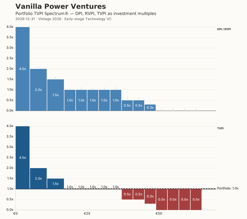
By years two and three, more initial tickets get written; a few of the earliest bets fail to mark up at the next round and become partial write-offs; a handful of others climb sharply on their first up-round. Year four brings still more initial tickets, the first full write-offs, and the beginning of follow-on investments into the names that are already out-performing.
Looked at in isolation, the year-four spectrum is unremarkable. Looked at as the fourth frame of a sequence, it is the moment the eventual shape begins to declare itself.
Year 5 — Bifurcation in full
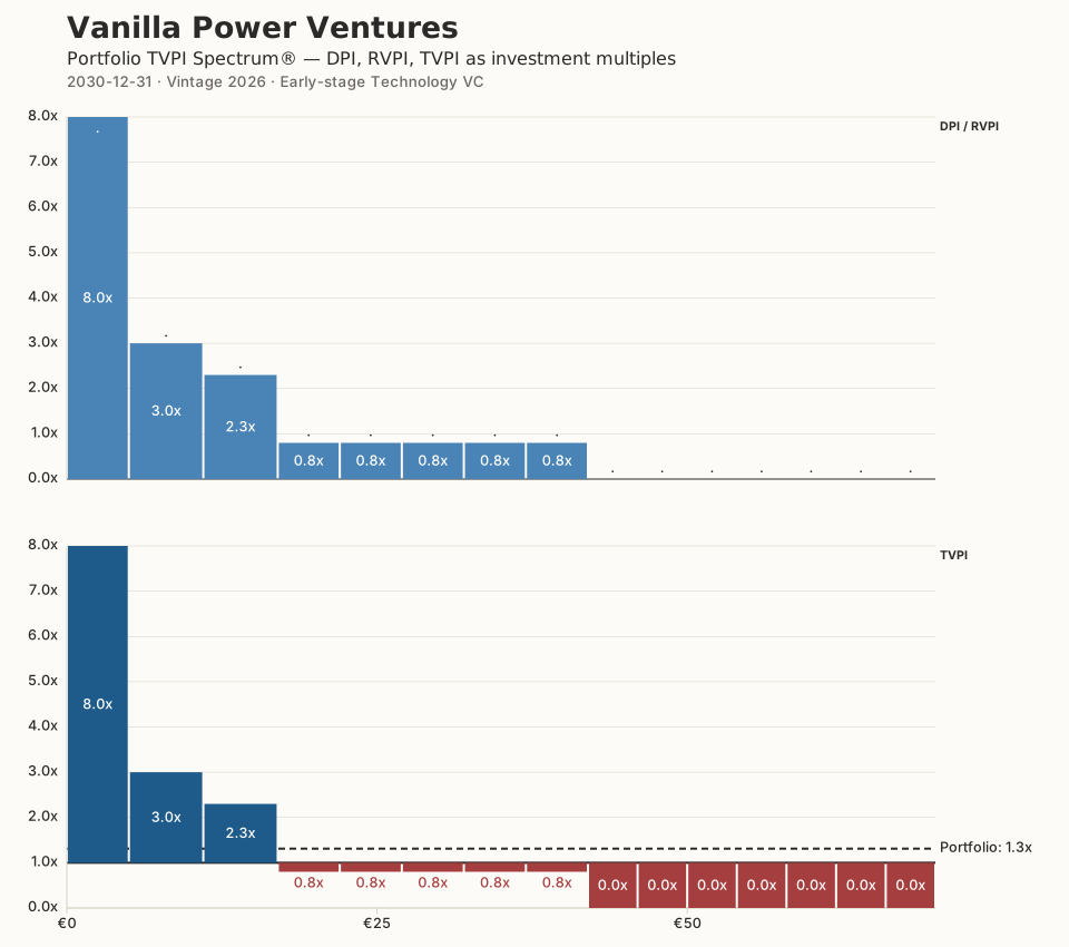
Year five is when the picture changes character. The investment period is ending; the last initial tickets are written; bifurcation is now in full. The spectrum shows three sub-populations the summary statistics cannot keep separate: tall outliers at the left, a middle pack between 1× and 3×, and a growing tail of write-offs and zombies at zero.
The mean TVPI at this point will be pulled high by the two or three outliers; the median will sit somewhere in the middle pack; the modal outcome is zero. None of those three numbers, alone or together, says this is what your portfolio looks like. The variwide does.
Years 6–10 — Management period and first exits
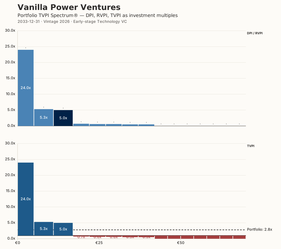
No more initial tickets. The fund is now in management mode. What happens in the upper variwide between years six and ten is the slowest-moving and most consequential part of the lifecycle: the leaders increase their distance from the field. Follow-on capital is deployed almost exclusively into them. Partial and full write-offs continue at a steady clip in the tail.
The lower variwide — the same TVPI series, with bars offset to a 1.0× baseline so that distributed capital is visually separable from residual value — begins to fill in. Year seven brings the first cash distributions from successful exits; year eight, more; year nine, more still. By year ten the portfolio still holds significant residual value, but a real DPI is now visible.
The shape that was hinted at in year five is now unmistakable. It is, finally, recognizable as a power law: a small number of very large outcomes, a band of acceptable ones, and a long tail of zeros. The lifecycle has not so much created the shape as revealed it.
Years 11–12 — Wind-down
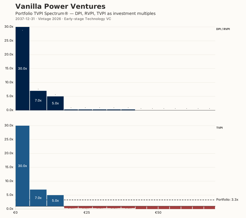
The extension period delivers the last few exits. Leaders run and exit. The remaining residual value crystallizes into final cash distributions. By year twelve the fund is liquidated and the spectrum stops moving.
The final picture is not a surprise. It is the year-five frame grown up. The same bifurcation, the same outliers, the same tail — only now in cash rather than in marks.
What the spectrum shows that the summary numbers cannot
Mean and median are projections of the distribution onto a single axis. Each throws away the very feature that defines venture: that one or two investments per fund carry most of the return. The TVPI Spectrum® refuses to throw it away. The bar widths preserve capital weight; the heights preserve multiple; the colors separate realized from unrealized. The shape is the data.
For LPs deciding how to size their next commitment, for GPs explaining what is happening in their portfolio mid-fund, and for advisors writing about the asset class, the picture replaces an argument with an observation. Mean-versus-median in venture returns is no longer a debate; it is a flattening of something that has dimension.
We built the Portfolio TVPI Spectrum® Generator so that anyone can produce this picture for their own portfolio in a few minutes, free, in the browser. The animated lifecycle on the landing page shows the twelve-year evolution for a fictional early-stage portfolio. The methodology — what DPI, RVPI, and TVPI mean here, how the variwide grammar works, how to read the dual-stacked layout — is documented in the methodology page.
Sebastian Mallaby gave the asset class the words. The picture has been waiting to be drawn.