1. Methodology
What the tool draws
The TVPI Spectrum® is a dual variwide diagram of a portfolio — a set of capital allocations to one or more components (portfolio companies, deals, funds in a fund-of-funds, etc.). For each component you supply DPI, RVPI, and the amount invested. The tool computes the component-level TVPI and an amount-weighted portfolio aggregate.
The same diagram also works for fund-level performance: treat each portfolio company as a component, and — if you want a net-of- fees fund picture — add one extra row representing fund expenses (management fee + carry + other costs) as a component with the appropriate DPI / RVPI signature. The tool is agnostic about whether your aggregate is gross-of-fees portfolio performance or net-of-fees fund performance; that's an input choice you make explicit by the rows you enter.
DPI — Distributions to Paid-In Capital
Cumulative cash distributions returned from a component, relative to the capital paid into that component. Represents realized value. A DPI of 1.5× on a €10M investment means €15M has been distributed. At the portfolio aggregate, DPI is the amount-weighted average of component DPIs.
RVPI — Residual Value to Paid-In Capital
Current fair market value of the unrealized holdings in a component, relative to the capital paid into that component. Represents unrealized value. An RVPI of 1.3× means the residual is marked at 1.3× of the amount invested.
TVPI — Total Value to Paid-In Capital
Sum of realized and unrealized value, divided by paid-in capital: TVPI = DPI + RVPI. This is the total investment multiple. The tool computes TVPI for you — you don't enter it directly. Whether your TVPI is gross-of-fees or net-of-fees depends on whether you've added a fund-expenses row.
Why a dual variwide diagram?
A standard bar chart hides the size of each component — a 3× return on €0.5M looks identical to a 3× return on €50M. A variwide diagram makes each bar's width proportional to the amount invested, so area encodes capital deployed and height encodes the multiple.
The TVPI Spectrum® stacks two equally-tall variwide views in a single page-ready square frame (960 × 960):
- The upper chart stacks DPI (dark) and RVPI (light) per component, so you see at a glance which positions have already returned cash versus which still carry residual value.
- The lower chart shows TVPI per component on the same Y-axis as the upper chart. The only difference is visual: bars begin at 1.0× (the breakeven baseline) rather than at zero, and bars below 1.0× are drawn downward in brick-red while bars above 1.0× are drawn upward in blue. A dashed line marks the portfolio-level TVPI so every component can be compared against the aggregate.
Design philosophy — addressing both Kahneman systems
Visually the chart works because it uses the Gestalt grouping principles — proximity, similarity, figure / ground, continuity, common region — to make the per-component story legible in a single glance (Kahneman System 1) while the methodology section above and the inputs and JSON-schema sections below supply the audit trail (Kahneman System 2). The two cognitive modes are served by two distinct layers of the design, not by compromise between them.
The same visual grammar appears in AQAL's other public data-visualization work — see the Worldwide GHG Emissions variwide diagrams for the grammar applied to per-capita climate accounting. That two unrelated subject matters share the same chart language is intentional: the TVPI Spectrum® is part of a practice, not a one-off.
2. Inputs
Portfolio identifiers
- Fund name (required) — the portfolio or fund name; appears as the chart title.
- Report date (required) — the as-of date for the metrics.
- Vintage year — optional, appears in the metadata line.
- Strategy — optional, free text (e.g. Growth Equity).
Chart settings
- Currency — EUR (€), USD ($), or a custom symbol you supply.
- X-axis — Normalized shows each bar as a percentage of total invested (0–100%); Absolute shows actual amounts with a chosen Max Fund Size.
- Y-axis — Auto-scale picks a tidy max above the largest TVPI; Manual max lets you fix the upper bound (useful for comparing two portfolios on the same scale).
Investment table
Four columns per row, one row per component:
- Name — component name (portfolio company, deal, sub-fund, etc.).
- DPI — multiple of the amount invested in this
component (e.g.
1.5for 1.5×). - RVPI — multiple of the amount invested in this component.
- Amount invested — in the chosen currency.
TVPI is computed as DPI + RVPI; there is no separate TVPI column. DPI and RVPI are entered as multiples, not as cash amounts.
Excel paste format
Copy four columns from Excel and paste into the Paste from Excel box. Tab-separated, one component per line, in this order:
Apex Robotics    1.5    1.3    12000000
Vantage Health   0.8    1.3    8500000
Helios Energy    0.4    1.2    15000000
Click Parse & Add. Existing rows are preserved; pasted rows append.
3. JSON schema (Save / Load)
The Save JSON button downloads a file named
[fund-name]-portfolio.json with the shape below.
Load JSON reads the same shape back. Schema version is currently
1.
{
  "version": 1,
  "fundName": "Horizon Growth Fund III",
  "reportDate": "2025-12-31",
  "vintageYear": 2019,
  "strategy": "Growth Equity",
  "currency": "EUR",
  "currencyCustom": "",
  "xMode": "normalized",
  "fundSize": null,
  "yMode": "auto",
  "yMax": null,
  "investments": [
    {
      "name": "Apex Robotics",
      "dpi": 1.5,
      "rvpi": 1.3,
      "amount": 12000000
    }
  ]
}
Files saved with an older schema that included a tvpi
field per investment are still readable; the value is routed into DPI
on load, and a fresh DPI + RVPI sum becomes the new TVPI.
4. Export
Four buttons
- Copy SVG — places a multi-type
ClipboardItemon the clipboard: a 2× PNG raster (which is what Word/PowerPoint/Slack will paste) plus the SVG source astext/plain(for code editors and vector apps). - Download SVG — saves
[fund-name]-tvpi-spectrum.svg. Vector; imports cleanly into Illustrator and into PowerPoint / Word via Insert → Picture. - Copy PNG — a 2× raster on the clipboard. Use this for chat, email, and quick paste.
- Download PNG — saves
[fund-name]-tvpi-spectrum.pngat 2× resolution.
Vector-in-Office workflow
If you want the chart to stay crisp at any zoom in PowerPoint or Word, use Download SVG → Insert → Picture in Office. Clipboard paste into Office always rasterizes — that's an Office limitation, not ours.
Credit line
Every exported chart embeds a small credit line at the bottom:
"Diagram design by AQAL Capital. Get your own TVPI Spectrum® here."
The word here is an SVG <a> hyperlink to
tvpispectrum.com.
The link survives SVG export, so charts in Word, PowerPoint, and
browsers remain clickable. Per our
Terms of Use §3, this credit line must remain
intact in published materials.
5. Worked example
The sample portfolio Horizon Growth Fund III ships with the tool: 10 components, vintage 2019, reporting date 2025-12-31, growth equity strategy, EUR. Click Generate with the defaults to produce the chart below.
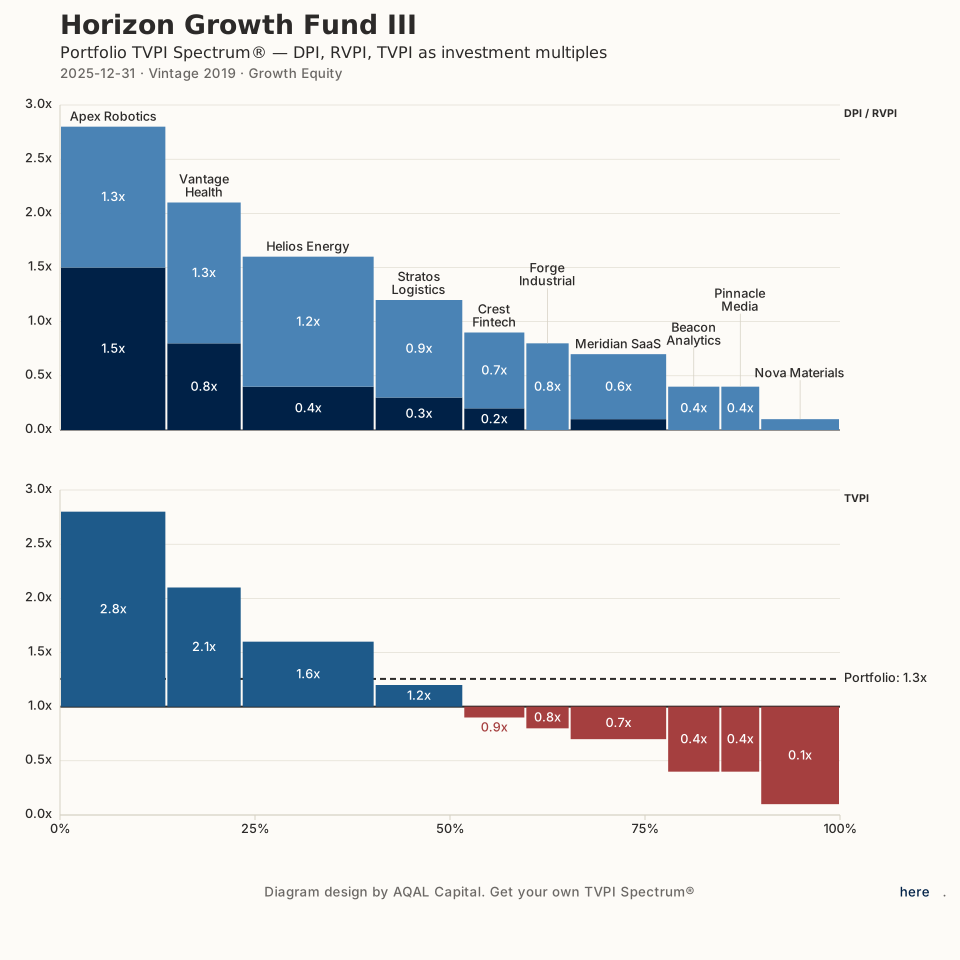
What to read off the chart
- Bar width tells you how much was invested in each component. Helios Energy (€15M) is wider than Forge Industrial (€5M), so even though both contribute to the portfolio TVPI, Helios moves the portfolio aggregate more.
- Upper-chart dark vs. light tells you the realization stage. Apex Robotics is mostly dark (DPI 1.5× — capital largely returned); Helios Energy is mostly light (RVPI 1.2× — still unrealized).
- Lower-chart red vs. blue tells you winners vs. write-downs. Components with TVPI ≥ 1.0× are blue and sit above the 1.0× baseline; components with TVPI < 1.0× are brick-red and sit below.
- The dashed line (Portfolio: 1.3×) is the portfolio-level TVPI — every component can be compared against it directly.
Want net-of-fees fund TVPI? Add one more row called Fund expenses with an amount equal to your management fees + carry + other costs over the period, DPI = 0, RVPI = 0. The portfolio aggregate will then represent net fund performance.
6. FAQ
Where is my data stored?
On your device. The tool runs entirely in your browser; nothing is transmitted to AQAL Capital or any backend. Save JSON writes a file via your browser's file dialog, and Load JSON reads one the same way. If you then save that JSON onto a network share, a cloud drive, or your CRM, it can travel as far as your network reaches — but that's under your control, not ours. See our Privacy Policy.
Can I use this commercially?
Yes. Terms §3 grants you a free license to use the hosted site and the generated diagrams in commercial materials — fund reports, pitch decks, investor letters, publications — provided the embedded credit line and hyperlink remain intact and unaltered. What you may not do is copy or redeploy the source code; see Terms §4.
Why does TVPI = DPI + RVPI?
By definition. Realized value (distributions) plus unrealized value (residual NAV), both divided by paid-in capital, sum to the total multiple. Because the identity is exact, the tool computes TVPI for you and there is no separate TVPI input column — that removes a common data-entry inconsistency.
Can I use this for fund-level performance?
Yes. The tool is agnostic between component-level, portfolio-aggregate, and fund-level views. For a net-of-fees fund picture, add one row labelled Fund expenses (or similar) with the amount equal to management fees + carry + other costs over the reporting period, and DPI / RVPI set to zero. The portfolio aggregate then reads as net fund performance. See the worked example above.
Normalized vs. Absolute X-axis — which should I choose?
Normalized when you want to read each component as a share of the deployed portfolio (0–100%). Use it for like-for-like comparison across portfolios of different sizes.
Absolute when you want the X-axis to reflect actual monetary scale against a known fund size (so a partially-deployed fund shows visible white space to the right). Use it for fund-size context and pacing discussions.
How do I keep the credit line / hyperlink working in Word or PowerPoint?
Use Download SVG then in Office go to
Insert → Picture → From File. SVG inserted that way preserves
the embedded <a> hyperlink, so the word here
remains clickable. Clipboard paste into Office rasterizes the chart
and drops the link — that's an Office limitation, not a bug in the
tool.
What browsers are supported?
Modern evergreen browsers: recent Chrome, Firefox, Safari, and Edge. The tool uses standard SVG, the File API, and the multi-type Clipboard API. There is no support for Internet Explorer.