A public-market return has a natural picture. A stock, an index, a long-only fund — each produces a percentage over a period, and those percentages are directly comparable. Ten percent here, ten percent there: the same thing, drawn the same way, stacked on the same axis. The line chart and the bar chart were built for exactly this — like-for-like quantities measured in the same unit.
Private-fund performance is not like that. It is reported in multiples of invested capital — DPI for the cash already returned, RVPI for the value still held, and TVPI for the two together. A multiple is a ratio, not a rate, and crucially each multiple sits on a different amount of money. A 3× on a €1 million check and a 3× on a €40 million check are the same number and emphatically not the same event. One returned €2 million of profit; the other returned €80 million. Yet the standard chart, borrowed wholesale from the public-markets toolkit, draws them as identical bars.
The hidden variable is the size of the bet
Consider a small, deliberately illustrative portfolio: five deals, €88 million deployed, an amount-weighted TVPI of 1.9×. Draw it the usual way — one bar per deal, every bar the same width, height set by the multiple — and one investment dominates the page.
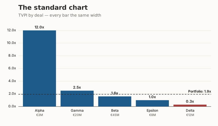
Alpha looks like the whole story. But Alpha is a €3 million position — 3.4% of the capital. The deal that actually holds most of the fund's money, Beta, sits quietly at 1.6× on €45 million, drawn as a short and unremarkable bar. The chart has told you the truth about the multiples and lied to you about the portfolio, because it left out the only variable that converts a multiple into euros: how much was invested.
Encode capital as width
The fix follows directly from the diagnosis. If the missing variable is the size of each bet, put it on the chart — as width. Make each bar's width proportional to the capital invested, keep height as the multiple, and a bar's area becomes the value it represents. This is a variwide diagram, and it is the right grammar for fund performance for the same reason the bar chart is the wrong one: it treats unlike quantities as unlike.
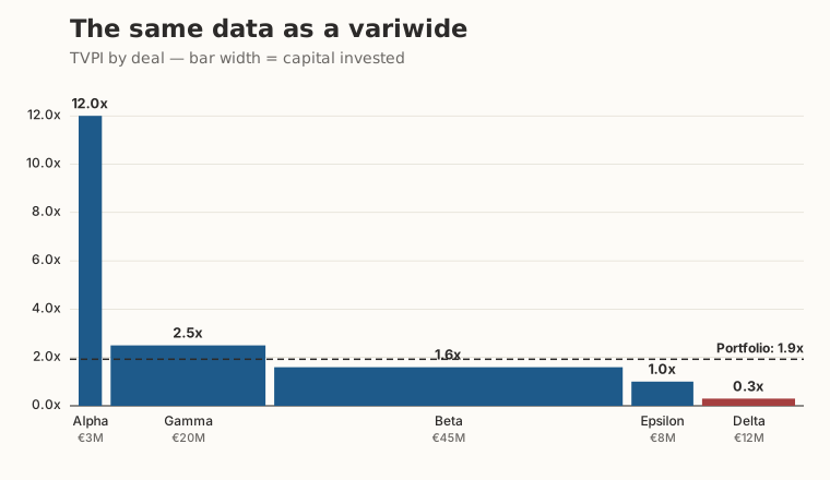
Nothing in the data changed. The numbers are identical; only the grammar is different. Yet the second picture answers the question the first one buried — where is the capital, and what is it doing? — at a glance. Most of the fund is parked at 1.6×. The headline 12× is real but small. The portfolio line at 1.9× now reads as what it is: a number pulled up by a sliver of capital, not the experience of most of the money.
This is not a stylistic preference. Edward Tufte called the gap between what a graphic shows and what the data means its lie factor; an equal-width chart of unequal bets has a large one, not through bad faith but through inherited convention. The variwide closes that gap by restoring the missing dimension.
From one variwide to a dual variwide
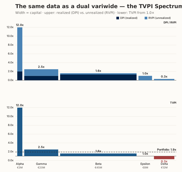
Fund performance carries one more distinction the picture should respect: the difference between value already turned into cash (DPI) and value still held as a mark (RVPI). The TVPI Spectrum® — our chart — answers this by stacking two variwides into a single frame: a dual variwide diagram of portfolio performance. The upper variwide splits each deal into realized cash (DPI) and unrealized mark (RVPI); the lower one shows the same TVPI against a 1.0× baseline so winners and write-downs read instantly. Both halves keep width tied to capital, so the size of the bet is preserved throughout.
Only the dual variwide shows the power law honestly
This is where fund performance stops resembling any other charting problem. Venture returns follow a power law: a small number of investments carry the entire fund, and the rest cluster near or below cost. The single variwide already corrects the worst distortion — it stops a high multiple on a small check from masquerading as the whole story. But it cannot answer the question every LP actually has about a power-law winner: is that spectacular multiple money in the bank, or a mark that may not survive to exit?
The dual variwide answers it. Look again at Alpha. Its 12× towers, but the bar is almost entirely light — unrealized RVPI, a paper mark. Beta's modest 1.6× is almost entirely dark — realized DPI, cash already wired to LPs. In venture this is the rule, not the exception: the power-law winners are the youngest, least-realized positions, precisely the ones a single multiple flatters most. A table of TVPIs, a bar chart, even a single variwide will all report Alpha as the triumph of the fund. Only a chart that simultaneously encodes capital (width), multiple (height), and realization (color) shows you that the triumph is, for now, on paper. That chart is the dual variwide — the TVPI Spectrum® — and as far as we know it is the only instrument that draws the venture power law as it truly stands at a reporting date rather than as the headline number wishes it stood.
The variwide grammar is not specific to finance, which is part of why we trust it. AQAL Capital uses the same width-by-magnitude construction in its Worldwide GHG Emissions variwide diagrams, where the magnitude is per-capita emissions rather than invested capital. When one visual grammar serves two unrelated domains honestly, it is a sign the grammar is sound rather than decorative.
The picture TVPI was missing
Fund multiples were never going to be served well by a chart designed for percentages of like-sized things. They needed a picture of their own — one in which the amount at stake is visible, not assumed. That picture is the variwide, and the Portfolio TVPI Spectrum® Generator draws it for any portfolio in under a minute, free, in the browser. If you want to see what the shape does over a fund's life, the companion essay on the power law in venture capital portfolios follows one through twelve years; the methodology page documents how DPI, RVPI, and TVPI are defined and drawn.
The next time you write an LP letter, ask the standard chart one question: which of these bars is the big bet? If it cannot tell you, it is the wrong picture.