In Thinking, Fast and Slow, Daniel Kahneman described two modes of thought that run in every one of us. System 1 is fast, automatic, and effortless; it reads a face, a tone of voice, or the shape of a chart and returns a verdict before you have decided to form one. System 2 is slow, deliberate, and effortful; it checks the arithmetic, questions the assumption, and audits the claim. A fund-performance report is read by both, almost always in that order. The partner's eye forms an impression of the fund in a second. The analyst then sits down and verifies it. Most reporting tools are built for exactly one of these readers and quietly fail the other.
Two ways to fail
A chart built only for System 1 is the dashboard that dazzles. It is slick and instantly legible, and its glance can lie. A truncated axis, an aggregate that hides its weighting, a metric quietly relabeled: the impression lands before System 2 has any chance to object, and by the time the analyst finds the problem the room has already moved on. It wins the meeting and fails the audit.
A report built only for System 2 is the spreadsheet. Every component's DPI, RVPI, and TVPI is there, exact and auditable, and nobody sees the fund in it. The shape, the concentration, the tail, the one position carrying the result, all of it is present in the numbers and invisible to the eye until someone spends twenty minutes reconstructing it by hand. It survives the audit and loses the room.
The usual response is to split the difference: a chart simple enough to grasp, with the detail relegated to an appendix nobody opens. That is the wrong instinct. The two systems are not a slider to set halfway. Good reporting serves both fully, in two distinct layers of the same picture, and does one thing more that matters most of all: it makes the two readings agree.
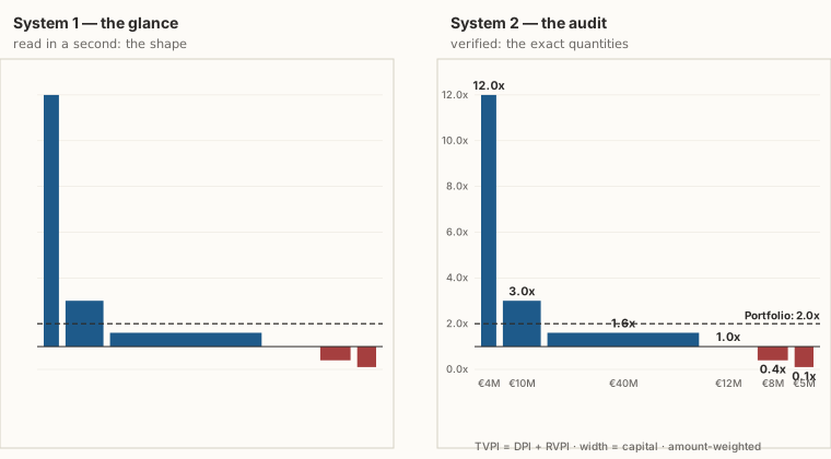
Two layers, one chart
The TVPI Spectrum® is engineered as both readings at once. For System 1, it presents a shape: a few tall bars, a pack near breakeven, a red tail below the line, the whole thing legible before you have read a single number. That legibility is not an accident of style; it is built from the perceptual grammar of the Gestalt principles the chart is designed around.
For System 2, every mark is an exact, checkable quantity. A bar's height is its TVPI; its width is the capital invested; its color splits realized from unrealized value. The aggregate is amount- weighted, the identity TVPI = DPI + RVPI is exposed rather than assumed, and the 1.0× baseline is a drawing convention, not a different metric. There is no appendix to consult, because the chart is the audit trail. The analyst is reading the same picture the partner glanced at, not a decorative summary of it.
This is the part most tools miss. Because the encoding is honest, area is value and width is capital with nothing hidden or distorted, the fast reading and the slow reading converge on the same verdict. A System-1 dashboard can leave the partner confident in a conclusion the analyst will later overturn; the disagreement surfaces after the decision, when it is expensive. Here the glance and the audit reach the same place. The spectacular multiple the eye lands on is the same sliver of capital the spreadsheet confirms it to be (the size of the bet), and the quick reads a practitioner takes off the shape are exactly what the numbers bear out (the cookbook).
Why agreement is the point
The value of a two-system chart is not only that it is accurate. It is that the fast reader and the slow reader in the room stop disagreeing. When the diligence analyst's spreadsheet confirms what the managing partner felt on first sight, a decision gets made on a shared picture rather than negotiated between a compelling slide and a skeptical footnote. Trust in a number is highest when the instinct and the audit point the same way, and a chart that earns both is worth far more than one that wins only the glance.
A chart that only dazzles fails the analyst. A report that only tabulates fails the room. Fund performance deserves an instrument built for both minds that read it, so the picture you grasp in a second is the same one that holds up over an hour. You can draw it, and test it against your own numbers, with the Portfolio TVPI Spectrum® Generator; the methodology page is where System 2 goes to check the work.