Once a portfolio is drawn as a dual variwide diagram, reading it is a skill you can learn in an afternoon and use for the rest of your career. The chart front-loads the answers: the things an analyst usually digs out of a spreadsheet — where the returns are concentrated, how much is cash versus paper, whether the winners are big bets or lucky small ones — are all visible in the shape. Here is the checklist. Five reads, roughly in the order the eye should take them.
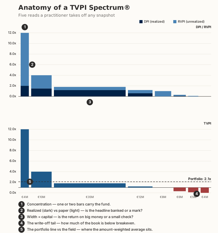
1. Concentration — how many bars carry the fund
Look at the top-left first. One or two bars towering over a low field is the venture signature: a handful of positions carry the whole result. A more even set of heights is a different animal: a credit book, a buyout fund, a diversified secondary. The number of tall bars is the fastest read of how concentrated, and how fragile, the return is.
2. Realized versus paper — the dark and the light
Now look inside the tall bars. The dark portion is DPI — cash already distributed. The light portion is RVPI — value still held as a mark. A towering bar that is almost all light is a paper unicorn: spectacular on the page, unrealized until it exits. A bar that is mostly dark has been banked. The single most important question about a headline multiple — is it money or a mark? — is answered by the color mix, not the height.
3. Width — is the return on big money or a small check?
Each bar's width is the capital invested. A tall, thin bar is a big multiple on a small check, real but a sliver of the fund. A wide bar carries serious money, so its height matters far more to the aggregate. Scan for the widest bars and check where they sit: a fund whose widest bars cluster just above breakeven is a very different proposition from one whose widest bars are among the leaders, even if the two share the same headline TVPI.
4. The write-off tail — how much is below the line
Run your eye to the right, below the 1.0× baseline, where the brick-red bars sit. That tail is the write-off rate, weighted by capital: a few narrow red bars is a healthy loss ratio; a wide red block is a meaningful share of the fund impaired. In venture the tail is expected and even necessary, but its width tells you how much capital paid for the winners.
5. The portfolio line versus the field
Finally, the dashed line: the amount-weighted portfolio TVPI. Its value is where most reporting stops. Its position relative to the bars is where a variwide adds something — if the line floats well above nearly every bar, the aggregate is being carried by one or two outliers and the typical position is far worse than the headline. Line high, most bars low, is the classic mean-versus-median gap made visible.
The reads over time: year 5 versus year 8
The same five reads, run on the same fund at two dates, tell the maturation story. Here is an early-stage venture portfolio at the end of its investment period (year 5) and again three years into the management period (year 8).
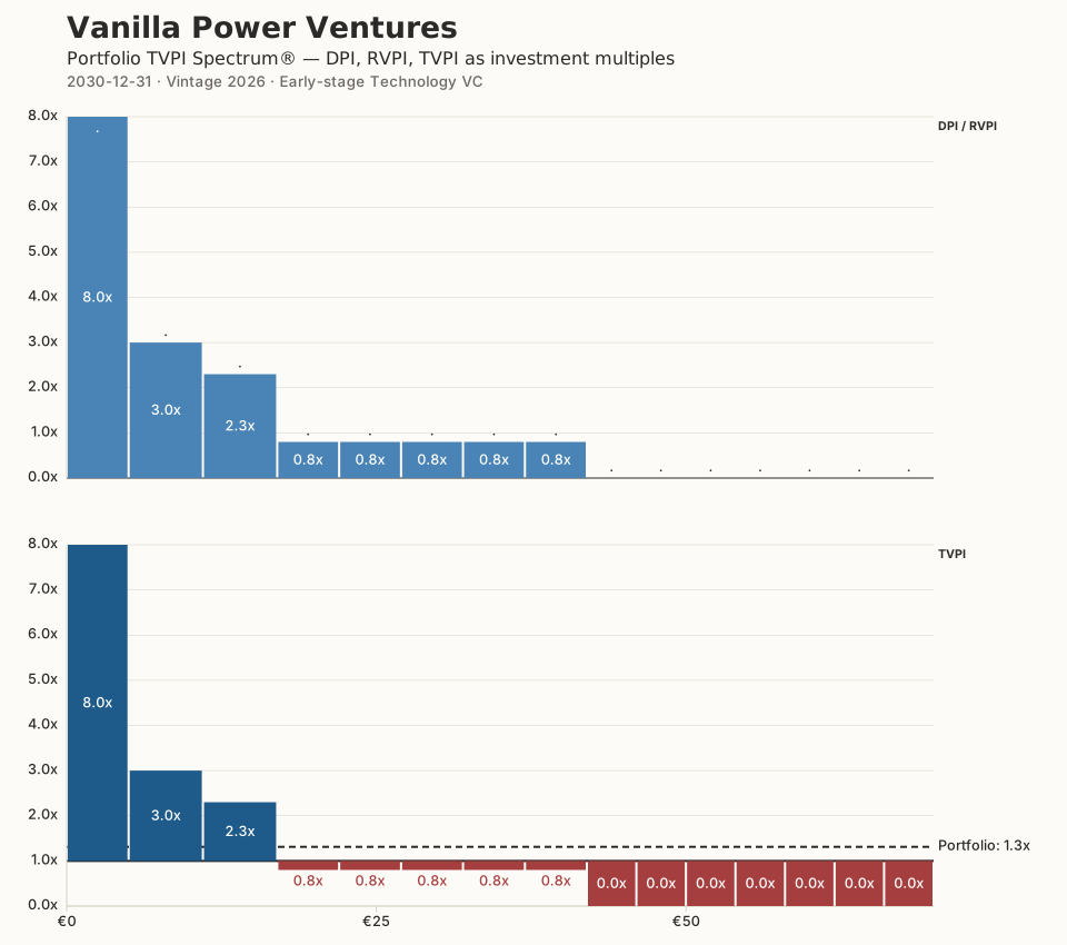
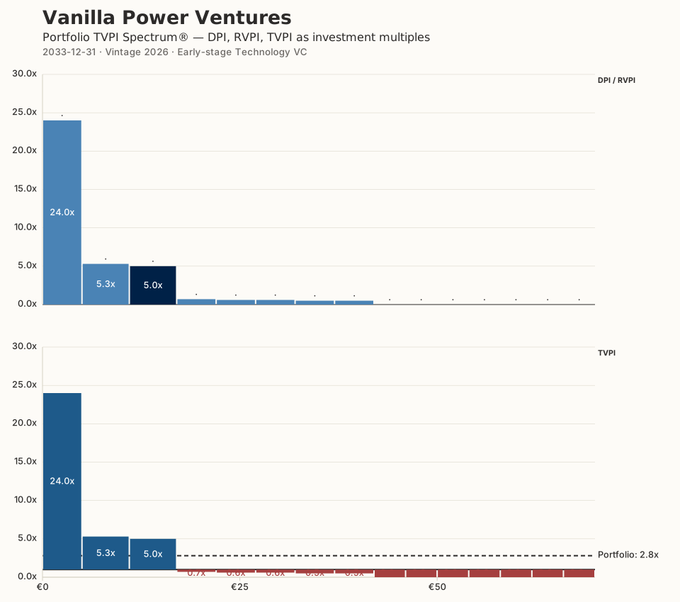
Read them side by side and the changes are exactly the ones the checklist points at: concentration sharpens (read 1), the dark portion grows as marks turn to cash (read 2), and the write-off tail firms up (read 4). What the shape does across a full twelve-year fund life is the subject of a separate essay on the power law; here the point is narrower and more useful day to day — the same quick reads work at any date, and comparing two dates is how you see a fund actually moving.
Using it tomorrow morning
None of this requires the chart to be yours. Given a manager's component-level DPI, RVPI, and amounts invested — the numbers that sit in most LP reports and data-room exports — you can draw the same picture and run the same five reads in a couple of minutes. Paste the figures into the Portfolio TVPI Spectrum® Generator, generate, and the anatomy above is staring back at you. For the argument that fund multiples deserve this treatment at all, see why TVPI deserves its own picture; for why the specific design choices make the reads fast, see Gestalt in fund-performance reporting. The methodology page has the exact definitions.
Learn the five reads once. After that, a chart that used to take a spreadsheet and twenty minutes takes a glance.